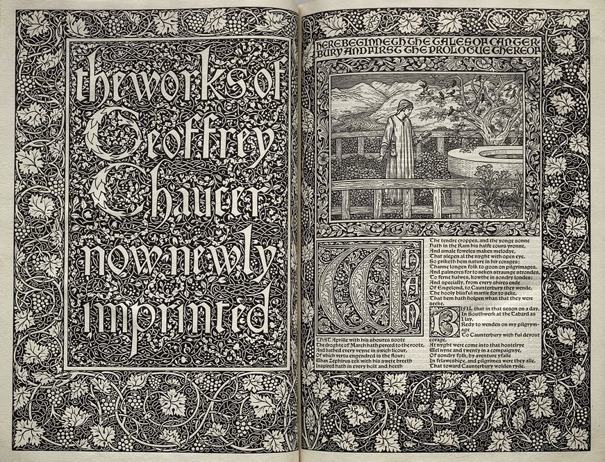
What did Morris ever do for us? The Kelmscott Press, so effective in bringing about a printing revolution, a watershed moment presaging the birth of the private press movement, was a stylistic dead end. The influence of the press was massive, although its life was extraordinarily short, operating from its foundation in 1891 to Morris’ death in 1896, finally closing down under the guidance of its Manager and Morris’ executor Sydney Cockerell in 1898. During that period it produced over 50 titles and fundamentally changed attitudes to printing. Yet despite this great influence the most interesting printers to follow Morris, whose work has best stood the test of time and has had greatest impact on subsequent typography, eschewed his style and turned their back on his heavily decorated pages. The ones who tried to imitate Morris, and there were many, are largely forgotten; who remembers the Essex House Press? Set up by CR Ashbee it inherited both pressmen and plant from Kelmscott; but sadly none of the magic.
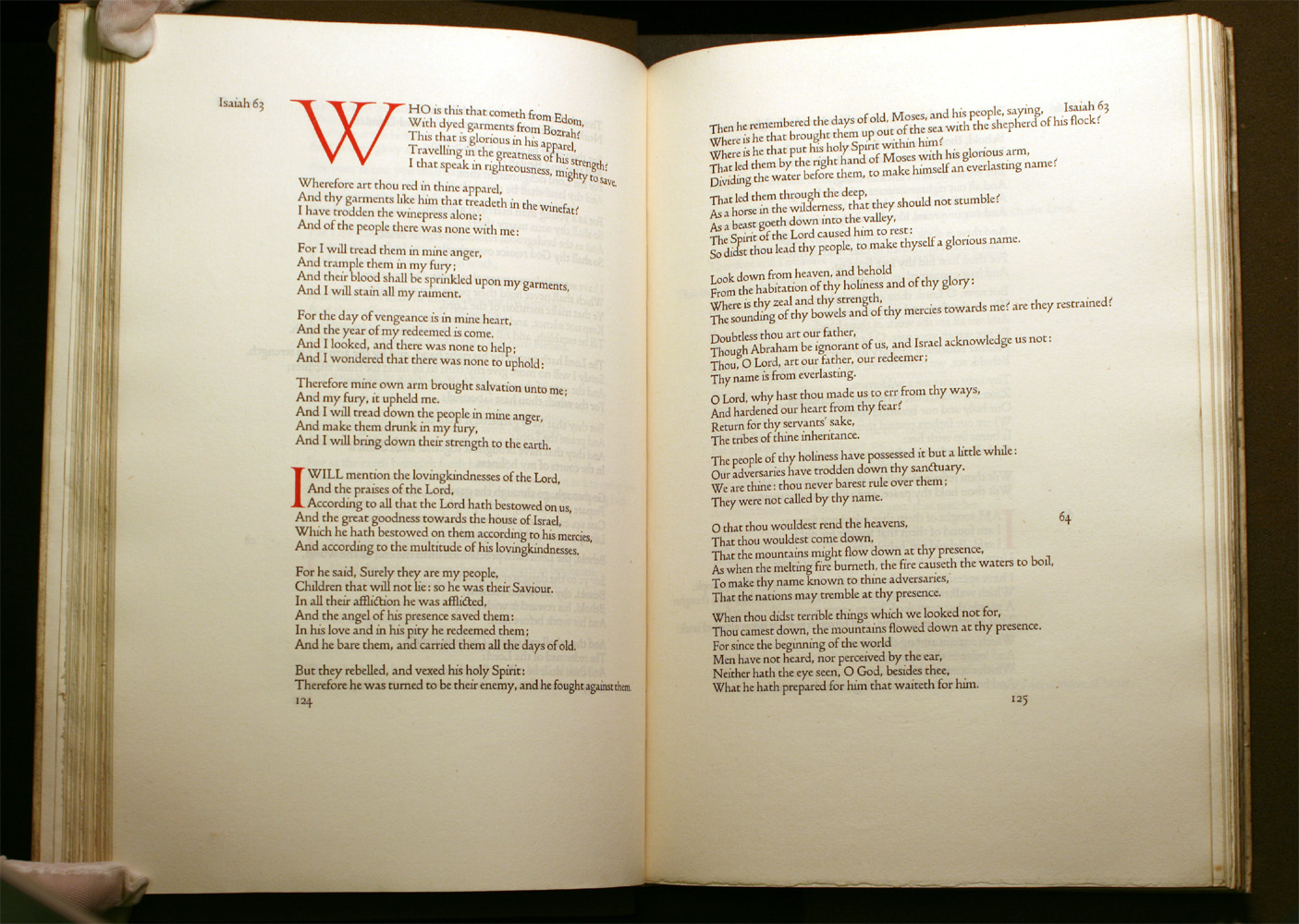
Two of the greatest presses to follow Morris were the Doves Press, set up by TJ Cobden-Sanderson and Emery Walker, and the Ashendene Press, set up by Charles St John Hornby.
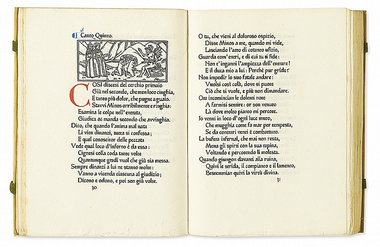
The change of mood from Kelmscott to Doves or Ashendene could not have been starker: suddenly white space, abhorred by Morris with a passion verging on agoraphobia, becomes an important part of the page. Simplicity, rather than rich complexity, becomes the vehicle of quality. This, on the threshold of the new century, established the central tenet of modern typography, articulated very famously by Beatrice Warde in a lecture entitled Printing Should be Invisible in 1930, subsequently published as The Crystal Goblet. You have a fine vintage wine, what do you prefer to drink it from? A heavy, jewel-encrusted gold chalice, or a clear crystal glass? The basic role of typography, conceived of by William Morris as being to create a beautiful object, has been fundamentally re-thought; Warde wrote:
Now the man who first chose glass instead of clay or metal to hold his wine was a “modernist” in the sense in which I am going to use that term. That is, the first he asked of this particular object was not “How should it look?” but “What must it do?” and to that extent all good typography is modernist.
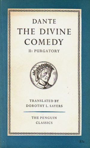
Beatrice Warde represented the modern thinking in typography best represented in England by the private press movement as well as some of the better trade publishers, notably Jonathan Cape. Perhaps the greatest expression of this classical simplicity came from Jan Tschichold, who was employed by Allen Lane in the post-war years to clean up the Penguin house style .
So what did Morris ever do for us? His greatest lesson, to go back to first principles, ironically proved to be his own undoing. But he did establish that a book had to have integrity, could be a thing of beauty and that all the components of a book, type, paper, binding and design had to be individually judged and evaluated. He also made money: the Kelmscott Press, like his other enterprises under Morris & Co, was commercially successful, well worth remembering by publishers today.